The Dotplot Seurat is a powerful visualization tool used in single-cell RNA sequencing (scRNA-seq) data analysis. This tool is part of the Seurat package, which is widely used for the analysis and interpretation of scRNA-seq data. The Dotplot Seurat enables researchers to visualize gene expression data across different cell clusters in a simple and intuitive manner. This article aims to provide a thorough understanding of the Seurat Dotplot, its applications, and how to interpret its results.
Introduction to Single-Cell RNA Sequencing
Single-cell RNA sequencing (scRNA-seq) is a revolutionary technique that allows the study of gene expression at the single-cell level. This technique helps researchers understand the complexity of cellular diversity and the functional roles of individual cells within a tissue. Analyzing scRNA-seq data can be challenging due to the sheer volume of data and the need for specialized tools to interpret it.
Overview of the Seurat Package
The Seurat package, developed by the Satija Lab, is one of the most popular tools for scRNA-seq data analysis. It provides a comprehensive suite of methods for data normalization, clustering, and visualization. It is a widely used tool for analyzing single-cell RNA sequencing data, offering functionalities like Seurat subset for selecting specific cell populations. In the comparison of Seurat vs Scanpy, Seurat is often praised for its intuitive interface and comprehensive visualization options. Among these visualization tools, the Seurat Dotplot stands out for its simplicity and effectiveness in displaying gene expression patterns across different cell clusters.
What is a Dotplot Seurat?
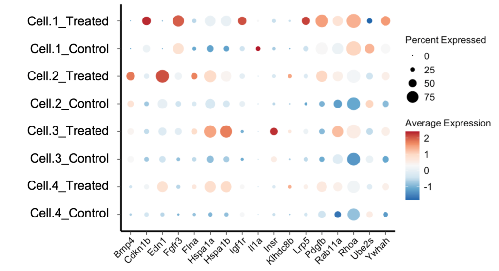
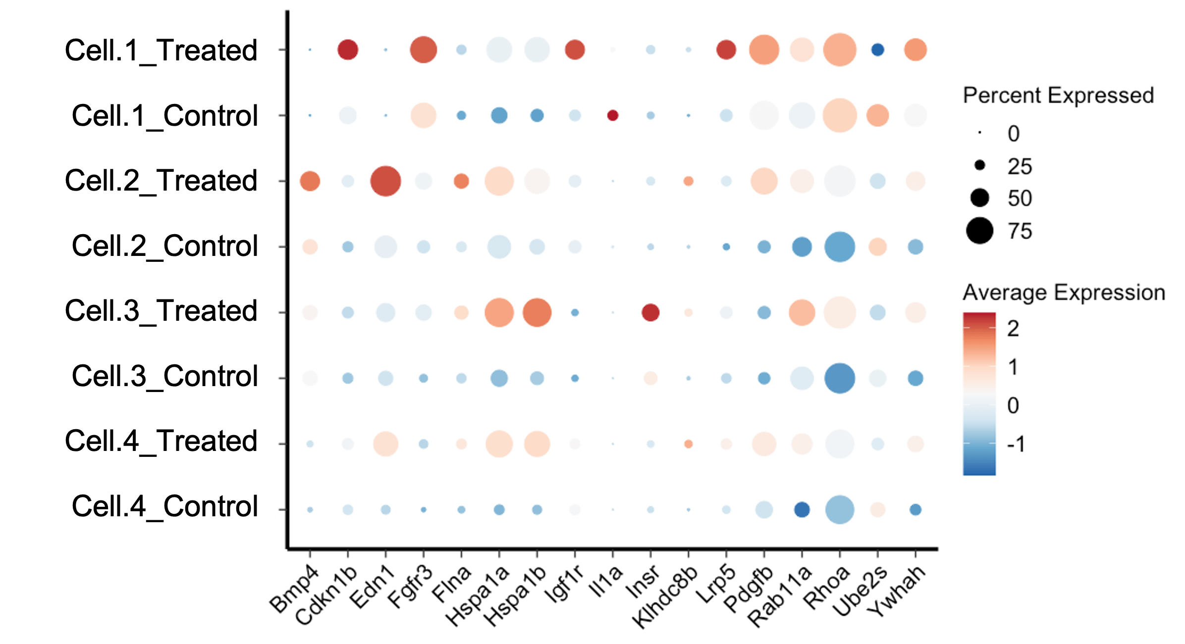
A Seurat Dotplot is a type of scatter plot used to display the expression levels of multiple genes across different cell clusters. Each dot in the plot represents the expression of a specific gene in a particular cell cluster. The size of the dot indicates the proportion of cells within the cluster expressing the gene, while the color intensity represents the average expression level of the gene within those cells.
Key Components of a Seurat Dotplot
- Genes: The genes of interest are displayed along the y-axis.
- Cell Clusters: The different cell clusters are shown along the x-axis.
- Dot Size: Indicates the percentage of cells expressing the gene within the cluster.
- Color Intensity: Represents the average expression level of the gene in the cluster.
Why Use a Dotplot Seurat?
The Seurat Dotplot is particularly useful for summarizing complex gene expression data in a clear and concise manner. It allows researchers to quickly identify patterns of gene expression across different cell types or clusters. This is invaluable for understanding the functional roles of genes and the relationships between different cell populations.
Creating a Dotplot Seurat
Creating a Seurat Dotplot involves several steps, including data preprocessing, clustering, and visualization. Below, we outline the key steps involved in generating a Dotplot Seurat.
Step 1: Data Preprocessing
Before creating a Seurat Dotplot, the scRNA-seq data must be preprocessed. This typically involves quality control, normalization, and identification of highly variable genes. The Seurat package provides functions to perform these tasks efficiently.
# Load the Seurat package
library(Seurat)
# Load your single-cell RNA-seq data
# Example data: pbmc_small
data("pbmc_small")
# Normalize the data
pbmc_small <- NormalizeData(pbmc_small)
# Identify highly variable genes
pbmc_small <- FindVariableFeatures(pbmc_small, selection.method = "vst", nfeatures = 2000)
Step 2: Clustering
After preprocessing, the next step is to cluster the cells based on their gene expression profiles. Seurat uses a graph-based clustering approach to group cells into clusters.
# Scale the data
pbmc_small <- ScaleData(pbmc_small)
# Perform PCA for dimensionality reduction
pbmc_small <- RunPCA(pbmc_small)
# Find clusters
pbmc_small <- FindNeighbors(pbmc_small, dims = 1:10)
pbmc_small <- FindClusters(pbmc_small, resolution = 0.5)
Step 3: Creating the Dotplot Seurat
With the data preprocessed and clustered, we can now create the Seurat Dotplot. This involves specifying the genes of interest and visualizing their expression across the identified clusters.
# Specify the genes of interest
genes_of_interest <- c("CD3D", "CD14", "MS4A1")
# Create the Seurat Dotplot
DotPlot(pbmc_small, features = genes_of_interest) + RotatedAxis()

Interpreting a Dotplot Seurat
Interpreting a Dotplot Seurat requires understanding the relationship between dot size, color intensity, and gene expression. Here are some key points to consider:
Dot Size
The size of each dot represents the percentage of cells within the cluster that express the gene. Larger dots indicate that a higher proportion of cells in the cluster express the gene, while smaller dots indicate a lower proportion.
Color Intensity
The color intensity of each dot reflects the average expression level of the gene within the cluster. Darker colors represent higher average expression levels, while lighter colors indicate lower expression levels.
Patterns and Trends
By examining the dot sizes and color intensities, researchers can identify patterns and trends in gene expression. For example, if a gene is highly expressed in a specific cluster, it may indicate that the gene plays a significant role in the function or identity of that cell type.
Applications of Dotplot Seurat
The Seurat Dotplot is a versatile tool with numerous applications in scRNA-seq data analysis. Below are some common use cases.
Identifying Marker Genes
Marker genes are genes that are uniquely or highly expressed in specific cell types. The Dotplot Seurat can help identify marker genes by highlighting the expression patterns across different clusters. This is crucial for characterizing cell types and understanding their roles in biological processes.
Comparing Cell Populations
The Seurat Dotplot allows researchers to compare gene expression profiles across different cell populations. This can reveal insights into the similarities and differences between cell types, aiding in the study of cellular heterogeneity and lineage relationships.
Investigating Gene Functions
By visualizing the expression of multiple genes across cell clusters, the Seurat Dotplot can help researchers investigate the functional roles of genes. This is particularly useful for studying gene regulatory networks and understanding how genes contribute to cellular functions and disease processes.
Advantages of Dotplot Seurat
The Seurat Dotplot offers several advantages that make it a preferred choice for visualizing scRNA-seq data.
Simplicity and Clarity
The Dotplot Seurat provides a clear and straightforward way to visualize complex gene expression data. The use of dots to represent gene expression makes it easy to interpret and identify patterns.
Scalability
Seurat Dotplots can handle large datasets with many genes and cell clusters. This scalability makes them suitable for analyzing extensive scRNA-seq datasets without compromising on clarity.
Customization
The Seurat package offers various customization options for Dotplots, allowing researchers to tailor the visualization to their specific needs. This includes adjusting dot sizes, color schemes, and adding annotations.
Limitations of Dotplot Seurat
While the Seurat Dotplot is a powerful tool, it does have some limitations that researchers should be aware of.
Loss of Detail
The Dotplot Seurat summarizes gene expression data, which can sometimes result in a loss of detail. For instance, it may not capture subtle variations in gene expression within clusters.
Interpretation Challenges
Interpreting the Dotplot Seurat can be challenging for researchers who are not familiar with the underlying principles of scRNA-seq data analysis. Proper understanding and training are required to accurately interpret the results.
Best Practices for Using Dotplot Seurat
To make the most of the Seurat Dotplot, researchers should follow some best practices.
Select Relevant Genes
Choose genes that are relevant to the biological question being studied. Including too many genes can make the Dotplot cluttered and difficult to interpret.
Use Appropriate Clustering
Ensure that the cell clustering is biologically meaningful. Incorrect clustering can lead to misleading interpretations of the Dotplot Seurat.
Interpret with Context
Always interpret the Dotplot Seurat within the context of the biological system being studied. Consider other data and findings to validate the insights gained from the Dotplot.
Conclusion
The Dotplot Seurat is a valuable tool for visualizing and interpreting scRNA-seq data. By providing a clear and concise representation of gene expression patterns across cell clusters, the Dotplot Seurat helps researchers gain insights into cellular functions, identify marker genes, and compare cell populations. While it has some limitations, following best practices can enhance its utility and ensure accurate interpretations. As scRNA-seq technology continues to advance, tools like the Dotplot Seurat will remain essential for unlocking the secrets of cellular diversity and function.


