Seurat is a popular tool used in the field of single-cell RNA sequencing (scRNA-seq) analysis. One of its most notable features is the Seurat Dimplot function. This feature is essential for visualizing data, understanding cell clusters, and gaining insights into biological phenomena. In this article, we will explore the various aspects of Dimplot Seurat, its importance, and how to use it effectively.
Introduction to Seurat
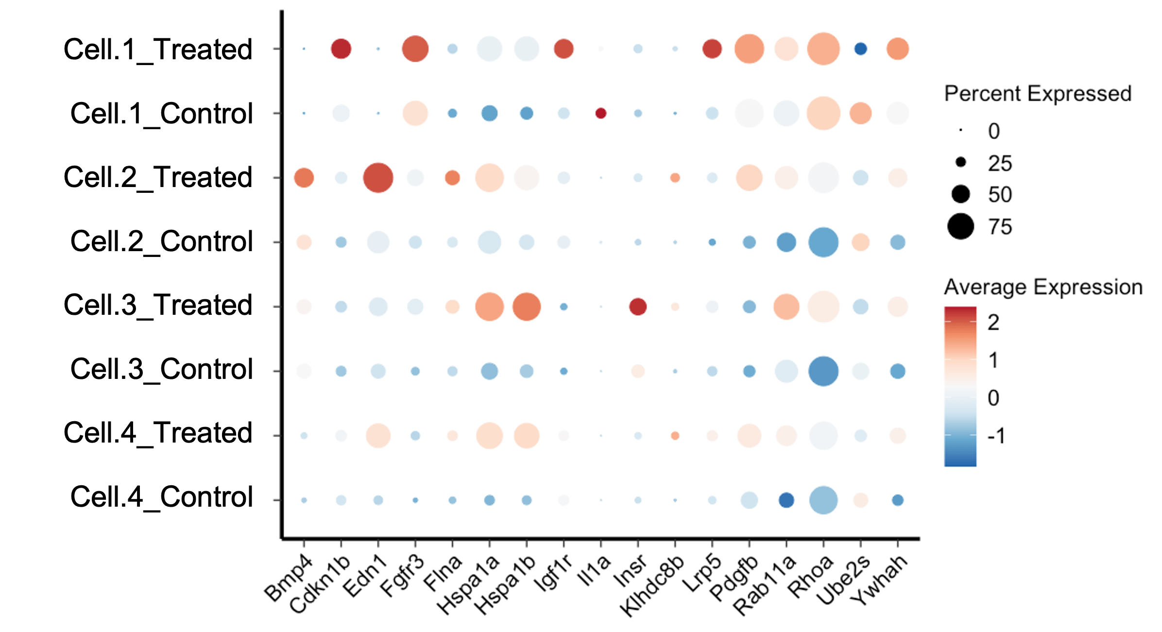
Seurat is an R package designed for the analysis and exploration of scRNA-seq data. Developed by the Satija Lab at New York University, it offers versatile tools like Seurat Dotplot for visualizing gene expression patterns and Seurat Subset for focusing on specific cell groups. When comparing Seurat vs Scanpy, researchers often weigh the ease of integration with other R packages and the comprehensive visualization options available in Seurat. By leveraging these features, Seurat enhances our ability to explore and interpret complex single-cell datasets.
What is Dimplot Seurat?
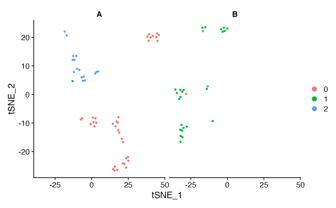
Dimplot Seurat is a function within the Seurat package that allows users to create scatter plots of cells in a reduced-dimensional space. These plots are typically generated using techniques such as Principal Component Analysis (PCA), Uniform Manifold Approximation and Projection (UMAP), or t-Distributed Stochastic Neighbor Embedding (t-SNE). By visualizing cells in a reduced-dimensional space, researchers can identify clusters of similar cells and explore the relationships between them.
The Importance of Dimplot Seurat
The Dimplot Seurat function is vital for several reasons:
- Visualization: It provides an intuitive way to visualize high-dimensional data in a 2D or 3D space.
- Cluster Identification: Helps in identifying and distinguishing different cell clusters based on gene expression patterns.
- Data Exploration: Facilitates the exploration of complex datasets, making it easier to generate hypotheses and insights.
- Presentation: Creates clear and informative plots that can be used in publications and presentations.
How to Use Dimplot Seurat
Using the Dimplot Seurat function involves several steps, from data preparation to visualization. Let’s go through the process step by step.
Step 1: Install and Load Seurat
Before you can use Dimplot Seurat, you need to install and load the Seurat package in R. You can do this by running the following commands:
install.packages("Seurat") library(Seurat)
Step 2: Load Your Data
Next, you need to load your scRNA-seq data into R. This can be done using various functions depending on the format of your data. For example, if your data is in a CSV file, you can use the read.csv function:
data <- read.csv("your_data_file.csv")
Step 3: Create a Seurat Object
Once your data is loaded, you need to create a Seurat object. This object will store your data and allow you to perform various analyses using Seurat functions, including Dimplot Seurat:
seurat_object <- CreateSeuratObject(counts = data)
Step 4: Preprocess Your Data
Before creating a Dimplot, you need to preprocess your data. This involves normalizing, scaling, and performing dimensional reduction. Here’s a basic workflow:
# Normalize the data
seurat_object <- NormalizeData(seurat_object)
# Find variable features
seurat_object <- FindVariableFeatures(seurat_object)
# Scale the data
seurat_object <- ScaleData(seurat_object)
# Perform PCA
seurat_object <- RunPCA(seurat_object)
# Perform UMAP
seurat_object <- RunUMAP(seurat_object, dims = 1:10)
Step 5: Create a Dimplot
With your data preprocessed, you can now create a Dimplot Seurat to visualize the cells in reduced-dimensional space:
DimPlot(seurat_object, reduction = "umap")
This command will generate a UMAP plot of your cells, showing how they cluster based on their gene expression profiles.
Customizing Dimplot Seurat
The Seurat Dimplot function offers various customization options to tailor the plots to your needs. Here are some ways to customize your Dimplot:
Coloring by Cell Type
You can color the cells in your Dimplot based on their assigned cell types or clusters:
DimPlot(seurat_object, reduction = "umap", group.by = "cell_type")
Adjusting Plot Size
To change the size of the points in the plot, you can use the pt.size parameter:
DimPlot(seurat_object, reduction = "umap", pt.size = 1.5)
Adding Labels
You can add labels to your Dimplot to indicate the identity of each cluster:
DimPlot(seurat_object, reduction = "umap", label = TRUE)
Choosing Different Reductions
While UMAP is popular, you can also use PCA or t-SNE for your Dimplot:
# Using PCA
DimPlot(seurat_object, reduction = "pca")
# Using t-SNE
DimPlot(seurat_object, reduction = "tsne")
Highlighting Specific Groups
If you want to highlight specific groups of cells, you can use the cells.highlight parameter:
DimPlot(seurat_object, reduction = "umap", cells.highlight = cells_of_interest)
Advanced Features of Dimplot Seurat
The Seurat Dimplot function also includes advanced features for more detailed analysis and visualization.
Splitting Plots
You can split your Dimplot into multiple panels based on metadata, such as sample origin or treatment conditions:
DimPlot(seurat_object, reduction = "umap", split.by = "sample")
Interactive Plots
For interactive exploration of your data, Seurat integrates with tools like plotly. This allows you to create interactive versions of your Dimplot:
library(plotly)
plot <- DimPlot(seurat_object, reduction = "umap")
ggplotly(plot)
Combining Plots
You can combine multiple Dimplots into a single plot for comparison purposes:
p1 <- DimPlot(seurat_object, reduction = "umap", group.by = "cell_type")
p2 <- DimPlot(seurat_object, reduction = "umap", group.by = "sample")
CombinePlots(plots = list(p1, p2))
Common Issues and Troubleshooting
While using Seurat Dimplot, you may encounter some common issues. Here are a few tips for troubleshooting:
Plot is Empty
If your Dimplot is empty, check the following:
- Ensure that the
reductionparameter matches the reduction method you used (e.g., “umap”, “pca”). - Verify that your data has been properly preprocessed and that the dimensional reduction was successful.
Clusters Overlap
If clusters in your Dimplot overlap too much, consider:
- Increasing the number of dimensions used in the reduction.
- Trying a different reduction method (e.g., t-SNE instead of UMAP).
Labels Are Hard to Read
If the labels in your Dimplot are hard to read, you can:
- Increase the font size using the
label.sizeparameter. - Adjust the position of the labels manually.
Case Studies: Applications of Seurat Dimplot
To illustrate the power of Dimplot Seurat, let’s look at a few case studies where this tool has been used effectively.
Case Study 1: Identifying Cell Types in a Heterogeneous Tissue
Researchers used Seurat Dimplot to visualize scRNA-seq data from a heterogeneous tissue sample. By generating a UMAP plot, they were able to identify distinct clusters corresponding to different cell types. This visualization helped them to understand the cellular composition of the tissue and to identify rare cell populations.
Case Study 2: Tracking Cellular Responses to Treatment
In another study, scientists used Seurat Dimplot to track how cells responded to a specific treatment. By comparing UMAP plots before and after treatment, they observed shifts in cell clusters, indicating changes in gene expression. This approach provided insights into the mechanisms of action of the treatment.
Case Study 3: Exploring Developmental Processes
Seurat Dimplot was used to study the development of an organism at the single-cell level. By creating PCA and UMAP plots, researchers were able to visualize the progression of cell states over time. This allowed them to map out developmental trajectories and identify key regulatory genes involved in development.
Conclusion
The Seurat Dimplot function is an invaluable tool for the visualization and exploration of single-cell RNA sequencing data. By reducing the complexity of high-dimensional data and allowing for the identification of cell clusters, it provides critical insights into biological processes. Whether you are identifying cell types, tracking treatment responses, or exploring developmental processes, Seurat Dimplot can help you make sense of your data and communicate your findings effectively.
In this article, we have covered the basics of Dimplot Seurat, including how to install and use the function, customize plots, and troubleshoot common issues. We have also seen how this tool has been applied in various research contexts. By mastering Seurat Dimplot, you can enhance your ability to analyze and visualize single-cell RNA sequencing data, ultimately advancing your research and understanding of complex biological systems.


